Introduction
In today’s video, we’re going to talk about one of the most well-known and widely used indicators in the trading world: the Bollinger Bands.
We’ll see how they work, how they’re built, and most importantly, how to use them to develop systematic trading strategies.
Specifically, we’re going to develop a mean-reverting strategy, meaning a strategy where we buy in an oversold area and sell in an overbought area.
But unlike most of our videos, where we usually develop strategies on futures, since they are well-suited for short-term trading, today we’ll focus on stocks, to see if there are any interesting edges we can take advantage of.
So let’s not waste time and dive right into the explanation of this well-known indicator.
How Bollinger Bands Work (Example on Amazon)
Let’s start right away with this chart. I’ve loaded a daily chart of Amazon, one of the most popular and widely recognized stocks.
The indicator plotted on the chart is precisely the Bollinger Bands.
As you can see, they consist of three lines. First, there’s a line, shown here as dashed, that represents a moving average.
Then we have an upper band and a lower band, which are calculated by adding and subtracting a certain multiplier, that is, a certain number of standard deviations, from the moving average.
So, what happens in practice? If we decide to increase or decrease the number of standard deviations we’ll simply end up with wider bands, or narrower ones if we decrease the number of standard deviations.
Another very important thing to consider is that, by default, this indicator comes with the following inputs: 20 for the moving average calculation and 2 for the number of standard deviations to add and subtract from the moving average.
Now, in the strategy we’re going to look at today, I’ve modified these values a bit.
Specifically, as you can see here, I chose 5 for the moving average calculation and 1.5 for the standard deviations.
Why did I decide to go this route? Simply because, this way, as you can see here, we end up with narrower bands and, certainly, more frequent signals.
Also, looking at how the price moves around these bands, it seems to give us reasonably good signals that we can use as a foundation to develop a strategy.
Another very important aspect to consider when using this indicator is that the Bollinger Bands adapt to volatility.
As you can see, when there are periods of high volatility, these bands tend to widen, while during periods of low volatility, they tend to narrow.
Why does this happen? Because, in fact, the standard deviation, which we use to create these bands, is a measure of dispersion.
And since it’s a measure of dispersion, the two bands will adapt to the most recent market context.
Tips for Trading Stocks
Obviously, this is something we appreciate because we won’t have bands positioned at fixed levels, but rather bands that adjust dynamically to market conditions.
Okay, as we mentioned in the introduction of this video, we’re going to develop a mean-reverting strategy and test it on a stock database.
So we won’t just run the strategy on a single stock to determine whether it works or not. Instead, what I did was recreate the historical database of the stocks that made up the Nasdaq index.
Specifically, this database contains many more stocks than the 100 we know today, because it also includes those that were delisted over time. For each stock, we check whether, on the specific day the strategy is executed, that stock was actually part of the index.
This way, we can clean the database from survivorship bias, which is essential when developing strategies on stock databases.
Otherwise, for example, we might end up with a portfolio that includes stocks that weren’t originally part of the Nasdaq but have grown significantly over time, and of course, that would completely distort our analysis.
That’s because the average trades would appear larger, or the number of available stocks at any given time wouldn’t be accurate.
How the Strategy Works
As for the strategy itself, since we said we’d be developing a mean-reverting strategy, we can build one like this.
The red band indicates oversold zones, while the green band indicates overbought zones. We can use these bands to develop a strategy where we buy when the price crosses below the lower band, and sell, or better said, close the long position when the price crosses above the upper band.
Why did I say “sell” instead of “go short”? Well, we could certainly test the short side too, but I can assure you that, due to the nature of stocks, that is, the underlying bias and long-term upward tendency, it’s very, very difficult to find strategies, especially simple ones like this, that work well on the short side. And I’d also add that it’s even harder for them to work well in multiday trading.
For this reason, we’ll focus on developing a long-only strategy.
The PowerLanguage Code of the Reversal Strategy
Alright, let’s not waste any more time and jump straight into Power Language Editor and analyze how the strategy works.
As you can see here, we have a few lines of code that, specifically, are used to develop a very simple strategy.
In fact, we have an upper band and a lower band, which are the two bands you see on the chart, the red band and the green band, which we’ll use to enter and exit positions.
Then I added one more condition, which you can see here labeled as condition1. It’s nothing more than a regime filter. Specifically, we’ll only trade if the closing price is above a 200-period moving average.
So, we’ll only take trades when the market is in an uptrend.
By the way, if you’re interested in learning more about this regime filter or moving averages in general, there’s a dedicated video on the channel.
Alright, getting into the core of the strategy, we have these two lines of code, where we check for an uptrend and another condition that must be true, which, in this case, isn’t too important. It’s just a condition used to correctly build the database and verify whether the stock on that specific date was actually part of the index.
That said, as far as the entry order goes, here’s the line of code we use.
If the closing price crosses below our lower band, we buy at market on the next bar. If instead the closing price crosses above the upper band, we close the long position at market on the next bar.
Alright, before we apply this strategy to the entire portfolio, let’s see how it works directly on Amazon’s chart.
As you can see, I’ve already loaded it here. I also set a cash per trade, so a fixed amount per trade, of $10,000. Since we’re dealing with stocks, and contract prices have gone up over time, this way we’re always investing a fixed amount of capital.
Backtest and Performance on Amazon Stocks
When we run the strategy, you can already see a few trades popping up. Taking one as an example, here you can see that the closing price is below the lower band, so we go long at market on the next bar. In this case, it’s 80 shares, but that doesn’t really matter. It’s just $10,000 divided by the closing price.
Then we exit the position if the price crosses above the upper band, and so we close it with a market order on the next bar.
Of course, there are other trades here as examples. And if we want to look at the overall performance on Amazon, we can see that the equity line is actually quite positive.
There are some flat periods, probably because either the price was below the 200-period moving average or, on that specific date, the stock wasn’t part of the index. But that aside, it seems like a really solid starting point.
Backtest and Performance on the Nasdaq Basket
The next step will be to apply this same strategy to the Nasdaq stock database.
This is something I’ve already done here in the Portfolio Trader. All that’s left now is to launch the backtest and take a look at the results together.
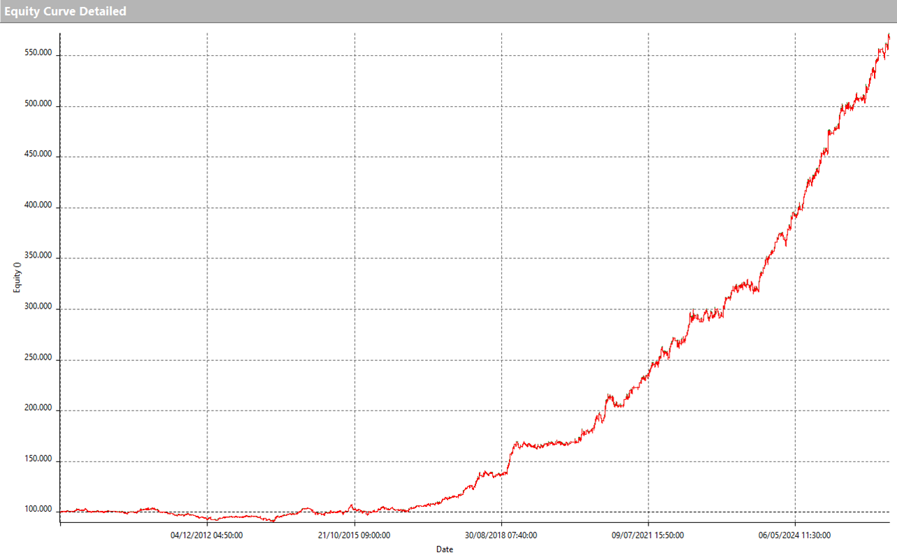
Here we are. This is the result of running the same strategy on the portfolio of the 100 Nasdaq stocks.
As you can see, overall, the result is quite positive. We have an equity curve that grows with fairly consistent momentum.
There are even some periods where the drawdown, compared to what we saw on the index, was barely noticeable, like in 2001 or 2002. And other periods, unfortunately, where the drawdown had a bigger impact, as we see here in 2022.
Another very important thing to consider, in order to better understand the metrics we’ll look at shortly, is that this portfolio was run with a capital of one million dollars.
Why is that? Because on average, the Nasdaq is made up of around 100 stocks, and if we allocate $10,000 to each one, we end up needing at least one million dollars in capital, assuming they all enter a position at the same time.
Alright, so let’s move on to the Performance Summary. Right away, we can spot some very interesting details here.
First of all, using one million dollars as a reference capital, we can see that the strategy had a maximum drawdown of just over 20%.
As for the return on max drawdown, which is the ratio between net profit and drawdown, we’ve got a pretty solid value of 11.25.
The annual return, in this case, is around 7%.
Okay, but now we need to figure out whether this strategy is actually tradable, and to do that, we’ll take a look at the strategy’s average trade.
To do that, let’s open up the Total Trade Analysis. Okay, here we can see that there were a lot of trades executed, over 22,000. That’s obviously because the portfolio contains so many symbols.
And clearly, we can see that all the trades are on the long side.
We’ve got a percent profitable, or win rate, that’s fairly high at 67%, which is typical of mean-reverting strategies. And looking at the average trade, we see that we’re just over 1% per trade, because $108 on $10,000 of capital works out to about 1%.
So, in this case, it’s definitely a solid starting point. That said, there are a few things to keep in mind. For example, the fact that unfortunately not all the stocks in this index are liquid enough. So there will be some symbols where this average trade won’t be sufficient, and others where it’s a very solid number, wide enough to cover operational costs like slippage and commissions.
Improvements to Make the Strategy More Efficient
Okay, at this point, let’s go ahead and make a modification to the strategy. Specifically, what I’d really like you to take away from this video, besides just understanding the classic way this indicator works, is the idea of experimenting a bit with the traditional rules we usually apply when using these indicators.
In this case, we saw that we’re entering with a market order on the next bar whenever a certain level is crossed, whether that’s the upper band or, in this case, the lower band.
But we could decide to approach it differently. Instead of using this indicator as the actual trigger, instead of executing trades the moment a certain level is crossed, we could decide to use it as a filter.
For example, we could choose to trade when the price is below this lower band, but instead of entering with a market order on the next bar, we could enter using a limit order triggered by the break of the low.
In this case, the lower band would act as our filter, our setup, so to speak, and the break of the low would become, in a sense, the real trigger of the strategy.
Alright, let’s go ahead and code this simple condition and see how this same strategy would perform on the same database of instruments, using this small variation.
To do that, I just need to make a simple change here: insert the condition that the close must be lower than the lower band, and instead of entering with a market order on the next bar, we enter with a limit order at the break of the low.
Let’s compile and check how the strategy changes directly on the Amazon chart. As you can already see, there are fewer trades being triggered, and that’s totally expected, because instead of just requiring an oversold level, we’re now looking for something even more extreme in a way. But the logic is still very similar.
For example, here the price crosses below the lower band, but we don’t enter with a market order on this bar. We enter with a limit order at the break of this low.
Performance of the Improved Strategy
Okay, if that’s all clear, I’d say we can move forward and run this strategy on the Nasdaq database.
And here’s the equity line for the new version of the strategy. As you can see, it’s actually very similar to the one we analyzed earlier, because fundamentally the core logic is more or less the same.
Let’s take a look now and see if there are any changes in the performance metrics of this strategy. Okay, starting with the maximum drawdown, we can see that it has decreased.
Before, we were around 20–21%, based on the invested capital of one million dollars. This time, we’re closer to 18%.
The annual return is still around 7%, but the net profit to drawdown ratio has improved. Previously, it was around 11, and now it’s at 13.44.
At this point, all that’s left is to take a look at the Average Trade.
Okay, taking a look here, the first thing we notice is that fewer trades are executed, partly because, as we mentioned earlier, this condition is a bit more restrictive. That is, the market needs to be even more oversold than in the previous setup we analyzed.
But especially when it comes to the Percent Profitable, we’re more or less at the same level. And when we look at the average trade, we’re pleased to see that it’s increased, from the $110 to over $140.
This is definitely good news because it’s an increase of over 30%, which clearly helps us absorb operational costs like slippage and commissions.
Obviously, there are many other types of analysis we could do. For instance, we could check which of these symbols the strategy performed best on.
Here, for example, Apple immediately stands out: the strategy performed very well on it. And of course, there are many others, like this one, which shows an even more linear equity line, and so on.
There are also some stocks where the strategy didn’t perform well and even resulted in a negative net profit. But clearly, in a portfolio-based approach, that’s perfectly acceptable.
What matters to us isn’t tailoring a single strategy to a specific instrument, but rather identifying a method that works on average across the stock market.
Conclusions and Further Ideas and Developments
So in conclusion, what can we take away from today’s analysis?
We saw how to use Bollinger Bands both as a trigger and as a filter. But more importantly, we explored an approach that performs reasonably well across stocks.
What are the next steps? We could come up with a selection criterion for choosing which stocks to trade, since at the moment we’re applying the strategy to the entire Nasdaq 100 portfolio.
We could, for example, identify a way to select the most volatile stocks, the least volatile ones, or maybe even the top-performing ones at any given time.
That way, we wouldn’t just improve the overall portfolio performance. We’d also make the strategy more suitable for a retail trader who doesn’t have a million dollars in capital.
Additionally, there’s another idea we could put into practice to further diversify.
In this video, we presented a mean-reverting strategy. But as most of us know, index futures in recent years have performed very well using a trend-following approach.
So, at this point, we could consider combining the strategy we presented today with a trend-following strategy on the Nasdaq future. Doing so would allow us to build a more robust portfolio.
In short, there are many paths we could take. At this point, all that’s left to do is roll up our sleeves and get to work on the development.